Why Every Business Needs a High-Converting Website in 2026
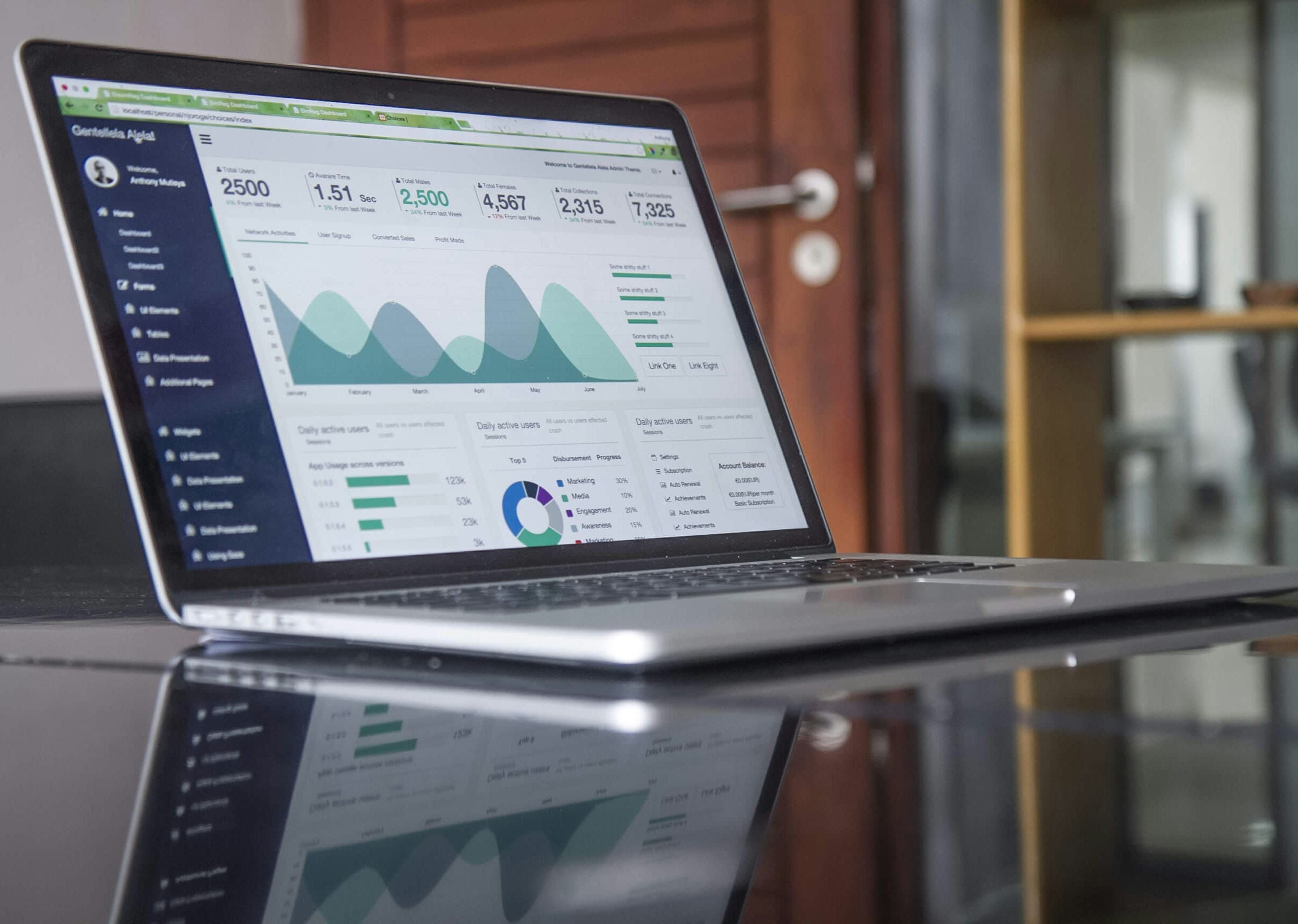
Your website is your digital showroom. Here's how a modern website can increase trust and generate consistent enquiries.
For most businesses, a website is the first real interaction a prospective customer has with the brand — often before a phone call, a visit, or a WhatsApp message. It has to do a lot of work in a short amount of time: explain what you do, who it's for, and why someone should trust you enough to take the next step.
What "High-Converting" Actually Means
A high-converting website isn't just one that looks polished. It's one where a visitor can quickly understand what you offer and knows exactly what to do next — book a call, request a quote, send a message. A beautiful site that leaves visitors unsure how to take action, or buries the contact option three clicks deep, will underperform a plainer site with a clear, obvious path forward.
The First Few Seconds Matter Most
Visitors decide very quickly whether a site is relevant to them. That means the hero section — the very top of the homepage — needs to answer three questions almost instantly: what do you do, who is it for, and what should I do right now. If a visitor has to scroll and hunt to answer any of those, you're losing people who would otherwise have been a good fit.
Trust Signals That Actually Help
Trust is built from specific, checkable details, not adjectives. A few things that genuinely help a visitor feel confident enough to reach out:
- Real, working contact information — a phone number and email that actually go somewhere
- A clear explanation of your process, so visitors know what happens after they contact you
- Verified testimonials and case studies, published only once they're real and confirmed
- Basic technical trust markers — HTTPS, a site that doesn't feel broken or outdated
Vague claims without evidence tend to do the opposite of building trust — visitors are used to seeing them and tend to discount them automatically.
Mobile-First Isn't Optional Anymore
For most service businesses, a majority of traffic now arrives on a phone, often from a Google search or a social media link. A site that was designed for desktop and just "shrinks down" on mobile usually has cramped tap targets, slow load times, and forms that are painful to fill out on a small screen. Designing mobile-first — and testing on an actual phone, not just a browser preview — tends to catch problems that desktop-first design misses entirely.
A Website Is a System, Not a One-Time Project
One of the more common mistakes is treating a website as a project with a finish line: launch it, and move on. In practice, a website's job is ongoing — it needs to stay fast, stay accurate, and keep working alongside your SEO and lead-follow-up systems as your business changes. A site that isn't revisited tends to quietly go stale: outdated service info, broken forms nobody noticed, and slow pages that used to be fast.
If your current site was built a few years ago and hasn't been touched since, it's worth an honest look at whether it's still doing its job — or just occupying a domain name.
Ready to Grow Your Business?
Get a free audit and see how we can help you scale.